

For a long time, when it came to images on websites, you basically had three options to play with. Most people are familiar with JPEGs, which are commonly used to display photographs as they offer the best levels of compression to keep file size low but quality high. PNGs (Portable Network Graphics) are useful when you need to display a logo or text in image form – they allow for much cleaner and crisper lines compared with JPEGs, although the trade-off of larger file size means they’re best kept for simple line work and low numbers of colours.
And of course there are GIFs (Graphical Interchange Format) – short animations now so popular for expressing reactions on Twitter and WhatsApp, but which have been in use to show animated content on websites since the late 1980s.
All of these image types are known as “raster” images – which means that they consist of a fixed number of pixels, effectively constraining them to their original drawn size or smaller (you can upscale a raster image, but you’ll suffer increasing quality loss as you do so). This is why graphic artists working for print will generally use “vector” images instead. A vector is a set of instructions to draw a particular set of shapes at whatever scale is demanded, making upscaling to any size a possibility.
Throughout the 1990s and early 2000s, it was generally never thought of as necessary to be able to display vector images on websites. But as screen sizes became more varied – not to mention larger at the top end – it became increasingly useful to be able to load images as vectors, so they could display at these variable sizes without having to be packed with millions of data-hungry pixels.
And so in 2001, the SVG (Scalable Vector Graphics) format was born. To start with, take-up was slow, as the benefits of being able to load graphics at smaller file sizes were often outweighed by the files being difficult to naturally scale on a web page. And as internet connections have got faster, loading speeds have been less of a concern.
But as someone who’s always been sceptical about the usefulness of SVGs, I’ve found my attitude changing recently – thanks to the fact that, unlike all other web image formats, SVGs can actually be altered live on the page. In web environments that are increasingly reliant on dynamic content, SVGs give you a power and a flexibility that plain old static PNGs and JPGs simply can’t.
The reason this is possible is because SVGs are encoded in a very similar style of markup language to HTML, the code that sits behind all web pages. This means that you can actually load an SVG directly in your page code (known as “inline SVG”), giving you the ability to manipulate it after loading just as you can any other element on the page.

A good example of this is on the website we developed for our client Magrock. We wanted to include on the site an animated logo that featured the letter “O” rotating through their corporate colours. This could have been achieved with a GIF animation, but would have meant the logo looking pixelated.
But because parts of an inline SVG can be targeted by CSS style rules, we were able to set an animation property on the “O” alone – rotating through each colour on a constant loop as intended. What was more, rendering the logo as a vector meant that its lines and curves were always smooth, even during the process of its shrinking and growing animations.
We really took advantage of the dynamic power of SVGs with the recently-launched site for The NP11. This collective of northern Local Enterprise Partnerships (LEPs) wanted to include on the site an interactive map, where users could click on each of the 11 LEP areas to find out more about each location as a place to live, work and invest.
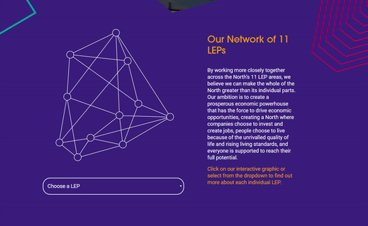
By displaying the map diagram as an SVG, not only could we apply animation to it (such as “lighting up” the graphic on first hover and further highlighting each map point as they are hovered on) but we could also detect when a particular element was clicked on, and trigger the relevant caption content to appear accordingly. The whole process is slick and smooth, giving the intuitive and user-friendly experience that the client desired. We were also able to change the behaviour of the graphic on mobile devices, by applying different CSS rules at smaller screen sizes so that users do not need to hover-tap to initially show the graphic in full colour.
These are just some of the capabilities that inline vector graphics give web developers – helping to extend the idea of dynamically-driven websites past just manipulating text content and into creating full, rich, interactive visual experiences that are also responsive, accessible and not held back by heavy loading times. And when our designers decide they want to do something fancy on a webpage, it’s nice as a developer to be able to tell them that we can do it easily…