
Most Graphic designers will know that you need to look beyond the current trends in order to produce fresh and vibrant designs. This requires a little bit of wizardry as we try to predict what is coming up next in the design and typography world. We also take a look back at the past for reference and inspiration as this can help to get those creative juices flowing and possibly even inspire new trends.
So that’s why I decided to delve deep into my typography archives and have picked out my top ten most interesting vintage and retro typography styles. I hope these reignite your sense of creativity, which might have been dwindling over the last few months…
Typography dates right back to the printing press which was created (as far as we know) in East Asia during the 11th century. It was then introduced to the western world by Johannes Gutenberg from Mainz in Germany during the 1440s. Fast forward to the 1470s, we started to use letterpress blocks made out of metal or wood. These blocks were the beginnings of what we know as typefaces, with an individual block being created for each letter. These were subsequently sold on to print shops, where a typesetter would set the fonts to allow for maximum legibility of the text.
Fast forwards again to the 1890s during which typography started to become what we recognise it to be today. It became an industry, with the invention of the linotype machine in 1886, the introduction of Monotype systems the following year and phototypesetting began during the 1950s. This led to a boom in the mass production of typefaces, interestingly a majority of the vintage typefaces I am going to take a look at were designed during this period!
Futura
Futura is a sans serif geometric typeface design by Paul Renner in 1927, initially as a contribution to the New Frankfurt Housing Project. Futura has been widely used since its release, including in the famous Supreme box logo, on the Italian Railway System and within pop culture.
Cooper Black
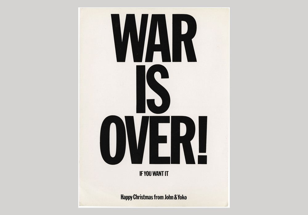
Although invented in 1922, its use throughout popular culture during the 1960s and 70s meant that Cooper Black began to embody this period’s style. Designed by Oswald Bruce Cooper, a lettering artist from Chicago, Cooper Black is an ultra-bold serif typeface, used predominantly for display.
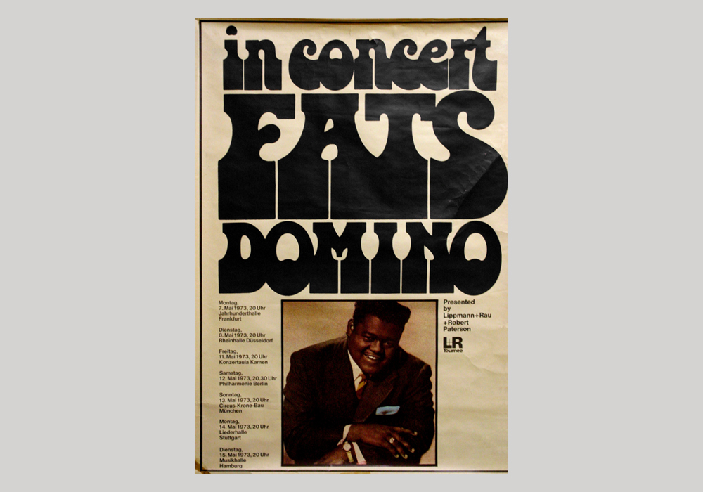
Village & Orbit
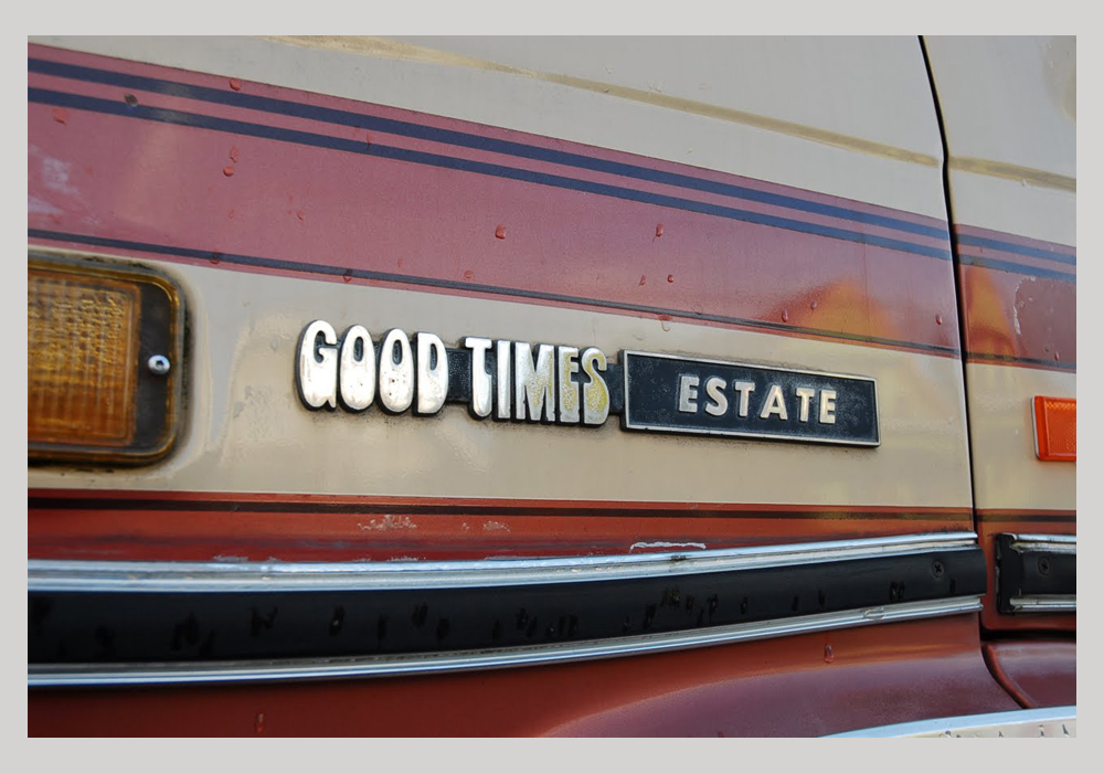
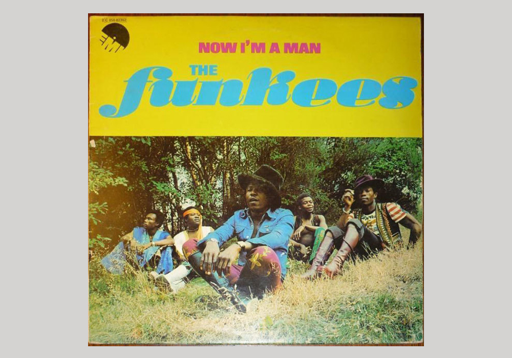
Two separate but very similar typefaces, Village & Orbit were designed by Humberto Gillan for Lettergraphics in 1968. Orbit is a common variant of Village, but without the flaring of the latter and a tail on the T and a straight legged R (only subtle differences to those who don’t study type closely). They were used extensively across record cover art but also in other more unusual places, such as on the tail of this 1983 Chevrolet Good Times Estate van.
Johnston
Londoners, or in fact anyone who has visited London, will immediately recognise Johnston – it’s the typeface used on London’s extensive transport network for the past 104 years. The influential sans serif typeface was completed in 1916 and is perfect for way-finding and signage, but has also widely used in advertising. We love how the tittle is shaped like a small diamond!
Bottleneck
Released in 1972, Bottleneck is a typeface that truly embodies the decade it was designed in. From designer Tony Wenman at foundry Letraset, Bottleneck brings to mind flares/bell-bottoms and platform shoes that were a huge part of the ’70s fashion. It was used broadly across soul and funk records, posters and advertising but also appeared on catalogues and everyday publications throughout the decade. It’s a great typeface to add a sense of the seventies to your designs.
Helvetica
Alternatively known as Neue Haas Grostesk, Helvetica is also a sans serif typeface by a Swiss typeface designer Max Miedinger. Helvetica was designed to be a neutral typeface with no intrinsic meaning in its form. It has subsequently become one of the most popular typefaces of all time, and can even be considered the holy grail of typography. Helvetica has universal possibilities and given it was invented 63 years ago it can definitely be considered a vintage typeface.
Gill Sans
British typeface Gill Sans was designed by sculptor, printmaker and typeface designer Eric Gill— naming his most famous typeface after himself. Gill Sans was released in 1928 by the British branch of Monotype who marketed it as “classic simplicity and real beauty”. It has been used in posters and advertising, including for the British Rail Network and on Penguin Books’ covers providing a simple and modern look.
Antique
The oldest example of vintage typography on my list, Antique was designed way back in 1828 by Wells & Web, a 19th century wood type manufacturer. Given its inception, it is not surprising that Antique started life as a typeface made from wood for woodblock printing. Luckily, it was revived for phototypesetting after it was introduced in 1949 and then interpreted for digital in 2006, so you can still use it to give your designs a rustic vintage look.
Franklin Gothic
Designed by Morris Fuller Benton in 1902 for the American Type Founders (ATF), Franklin Gothic was used extensively until it was eclipsed by some of the other typefaces discussed here during the 1930s. This didn’t last long as Franklin Gothic was picked up again the following decade. It has been widely used since and is especially effective if you’re looking to add some turn-of-the-century simplicity to a project.
Stilla
This chunky display typeface was designed by French type designer François Boltana, who worked for London foundry Letraset. Stilla was in fact one of the winners of the Letraset International in 1973. It can easily be identified by its bulbous serifs on both its uppercase and lowercase letters which is probably why I love it so much. Stilla was frequently used on the sleeves of Funk and Soul records in the decade of its release. It is, therefore, one of those fonts that really echoes the era it was created in.